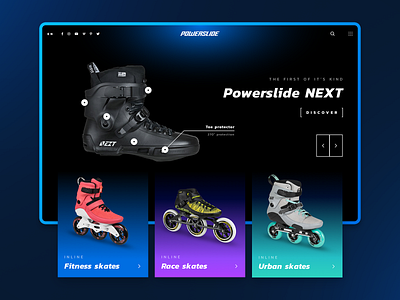
Powerslide Homepage Redesign Concept
Hello there! 🖐
Are you skate-addict just like me? Take a look at Powerslide homepage redesign. I focused on showing product segments in nice, clean sections.
Which one is better? Light 🌕 or dark 🌑 ? You decide! 👊
(Real pixels in attachments)
Don't forget to press L if you liked it 🙏
Thanks for watching!
We're open for business!
You can find us here: 7ninjas.com | Facebook | Instagram | Behance | Twitter
Would you like to hire us? Tell us more at hi@7ninjas.com
More by Mateusz Szymkowicz View profile
Like


