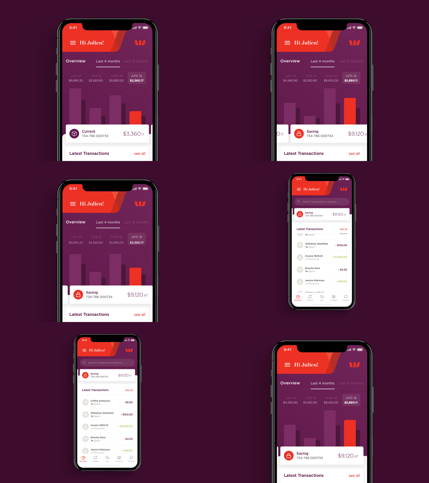
Westpac Dashboard 2018
Have a look on the IG post: https://www.instagram.com/p/Bp3z-qpBUqf/
🤔How Westpac can still have the current design interface?
I worked on a new dashboard interface of Westpac App using chart as the main highlighted graphic component.
This is my vision of what this dashboard should look like, with swipe cards, graphics and quick view of last transaction in a same screen.Devices is bigger now, why not use the entire screen with bigger spacing and more interactions?
👉Please comment and let me know your thoughts?
📩 Need a designer? Contact me info@jaja-design.com
#behance #behancereviews #brand #branding #brandbook #guideline #brandguide #palette #colorpalette #ios #typography #ui #ux #sydney #sydneystartup #banksydney #bankingapp #sydneydesigner #creative #design #digitalnomad #digitalnomadlife #weatpac #westpacsydney #app #iosapp #ios12 #iosdesign
