Book Icon Tweak
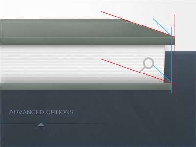
To hit on some points briefly, that I think will help this look more "normal" is getting some of your perspective stuff right. The back cover, or in this case bottom, that the book is resting on has a different angle for the part "returning" to the spine of the book than the top angle. Also, There is no shadow or sense that the paper is residing a little bit back on the bottom of the book like the top part that overhangs the paper. I know its difficult to explain so I added a visual. This is just to get you going;
Blue mark-up is what you current have.
Red mark-up is what it should be.
You can notice the perspective lines are off and this makes it look awkward. Also, I added basic brushing to the bottom of the pages. This will look more natural when you flush out the bottom green part to the red lines.
Good luck. Looks great! These tweaks will make the whole thing look more comfortable.