Device Management
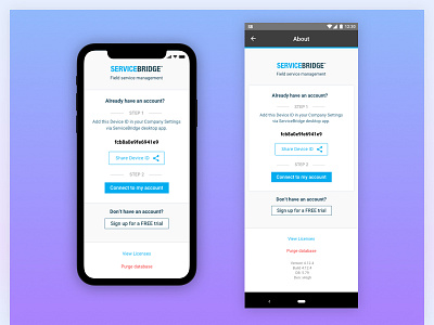
This screen is quite heavy on options and requires to process a few items on the screen to make a decision. The goal was to create visual hierarchy for primary, secondary and tertiary buttons while using the existing design guidelines.
What would you press?
More by Adomas Tautkus View profile
Like
