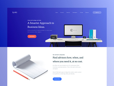
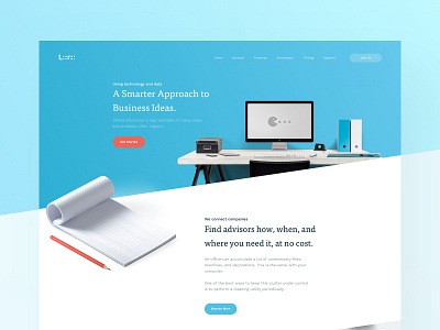
Lora Landing Page - Color Exploration
Hey guys 👋
Here is a full preview of a landing from the project Lora with a bit differen color scheme. Tried playing with a bit darkercolors and keep it distraction free. Hope you'll find it interesting.
Press L to like, view Real Pixels here & please don't forget to follow us!
Want similar design for your website?
Available for Hire - contactunopie@gmail.com
Thanks for watching! :)
More by UnoPie Design View profile
Like


