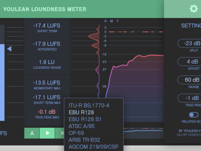
UX/UI Design for an Audio Meter Plugin
The plugin has won a KVR Developer Challenge award. And our team decided to give this plugin a look it deserves. This project had multiple UX iterations because the features were in development during intensive real user testing. The most complex about making the UI nice is its stretchability. As you never know what would be the extent of this. And the user would spend minimum 3 minutes to learn how it works, then some amount of time to get the real results with his music, typically at night, so a choice of colors is pretty moderate and primarily dark. Since the GUI is implemented with code, we simplified all the elements to something easily being coded. We like that some of our ideas eventually influenced the real UI design of the plugin. Cheers!
