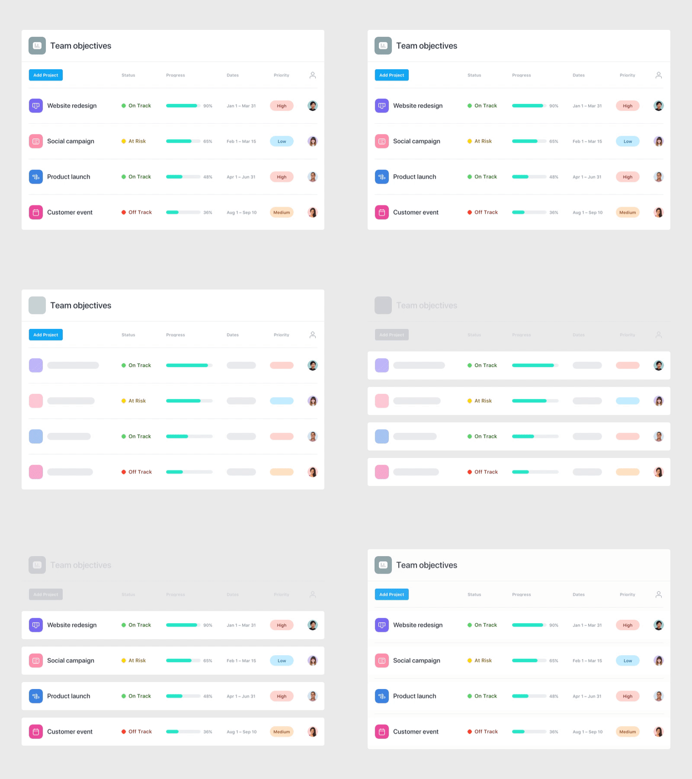
Asana Portfolios UI abstraction
Here's a lil' behind-the-scenes look at a UI abstraction study I created for Asana's recent Portfolios launch. There's value in exploring a range of different fidelities for these assets, as they end up in everything from hi-fi PR mockups to in-product explainer vids to bite-sized email GIFs. Providing the right context with less text also helps us localize assets faster as we expand across the globe 🌐
It's super cool seeing how @Amanda Buzard, @Devin Jacoviello, @Matt Riley, @Maya Ealey, @Greg Elzerman, @Hannah Swann, and @Anna Hurley put these abstractions to use in different ways 👌🏻
More by Asana View profile
Like


