Personal Site Redesign Version 2
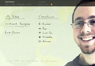
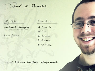
I decided to rework the background a bit more. And though I loved the old French feel that I had, it just didn't seem to mesh as well as I would have liked. So I added to the grainy background with some generatively rendered circles and a layer of hand-drawn Old English lettering.
To connect the front page with the rest of my site, and my other site, I went back to a dark navigation bar at the top. It felt a lot more anchored and gave me a bit more room to work with actual type faces instead of just handwritten lettering.
I set it live, today, if you'd like to take a look at it in its fully functional state. http://www.davidnbrooks.com
More by David Brooks View profile
Like

