Exploring Elements
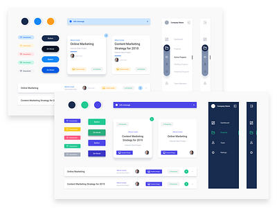
Hey Dribbblers! Just dropping some process work here. Exploring some elements for a current project I'm working on with a client.
After many iterations, it came down to:
Dark vs Light Navigation,
Rounded vs Squared Buttons,
and Centred vs Left Aligned text.
It's interesting how subtle differences can make all the difference.
More by Eloise Ambursley View profile
Like
