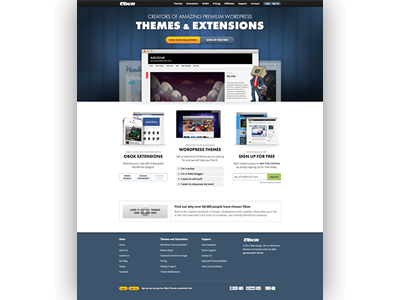
New home page - Squish Test
Spent the last 3 weeks planning and designing a new home page for Obox. The current one is old and out of context.
With the new one we want to place more emphasis on both themes and extensions we sell. We also want to remind peeps of free sign up.
I am nearing the end of the redesign, one of the last steps being the "Squish test" to see if the right things are catching the attention of the user :)
For the first time since redesigning Obox in 2010 I have actually user tested the new home page. So far the results are promising but I am sure there will be more mods coming in the future.
Overall I am quite happy with it though.
More by David Perel View profile
Like
