Ridewell Logo
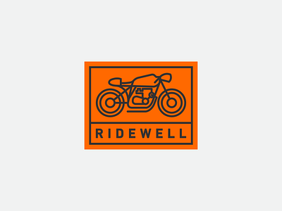
Ridewell is a motorcycle lifestyle blog run by my wife which focuses on gear reviews, philosophy, and safety tips. This logo was designed to be modern and minimalist, featuring a cafe racer line drawing as the primary symbol. DIN Bold was selected as the typeface, with the weight modified to match the stroke width of the lines in the illustration. A bright orange was selected as the primary brand color, as it is often used as a safety indicator on the road. The logo was then formatted to work horizontally for the website and in a circle as a stand-alone social media avatar.