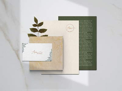
Ava Brands branding and packaging
Logo design and visual identity of Ava Brand!
From the name Ava - which comes from the Hebrew "life" - the concept of the multi-brand store project was developed, an expression of the founders desire for renewal.
The delicate typography of the logo dialogues with the aesthetics of the store clothes and with its client, sophisticated and feminine. The colors green and white, next to the golden texture brings modernity to the brand, and the clean and minimalist aesthetics build a timeless brand. A floral print has been developed expressing the authentic personality of the store and refers to the origins of its name.
Check out the whole project: https://goo.gl/MBNdRu
More by Gabriela Boaventura View profile
Like
