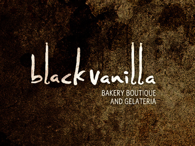
Black Vanilla Logo
Quite a departure to previous ideas, but one that the clients are really happy with.
The link to Black Vanilla would be in the 3 letter L's. These are the shape of actual Black Vanilla pods. Interestingly, the client said that one of the things that should be avoided was any kind of handwritten font. Hence the rather long road to coming up with this idea.
So rather than any obvious cup cake, coffee, ice cream yada yada visuals, we have a direct link to the shop name and one of the key ingredients, the very expensive Black Vanilla pod.
Whilst scratching my head for inspiration, I was just playing with some random fonts and 'accidentally' selected a certain hand styled font, which happened to be right next to a photo of a vanilla pod on my pasteboard. I saw the similarity with the shape immediately and pretty much knew this would be the subtle 'play' needed. Once the client first saw the font he was surprised to say the least at how much he liked it.
Fonts So the font has been redrawn from scratch, so it fits better with the actual shape of the pods. The edges have a subtle rough texture, so when the logo is blown up for the shop signage, it should look half decent. Repeating letters have also been modified so each occurrence is different. Close up of lettering
The tag line is set in Whitney HTF Book Condensed.
Pretty much job done. Now to make all the shop signage, take out food packaging etc. :)

