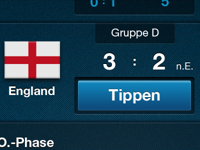
Soccer EURO2012 App - New Button Style
@Patrik Inzinger Thanks, you were right. Too much inset shadow combined. I cleaned that out a bit and made a much more classic button style. Leaves room to make the font bigger and is not that confusing.
More by Nikos Moutesidis View profile
Like
