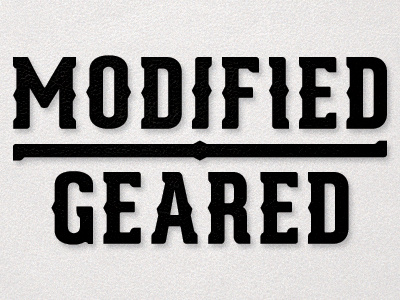
Modified Geared
Working on making some changes to the extrabold weight of Geared from Lost Type. Having some issues with the diagonals and the S, but it's coming along.
Some feedback questions: Which 'I' looks better? Should the right side of the 'D' have a point like the 'O'?
More by Cory Angen View profile
Like
