Lack of Direction
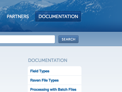
I noticed how much I fell into tried-and-true design patterns as I put together this mockup. They gave me close to zero visuals or ideas as a starting point.
Fade-out header photo? Check.
Glossy buttons? Check.
Thin border effects? Check.
White-on-gradient fadeout? Check.
Surprisingly, I actually like the completely monotone result.