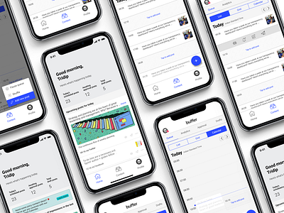
Overview of scheduled content : Buffer case study
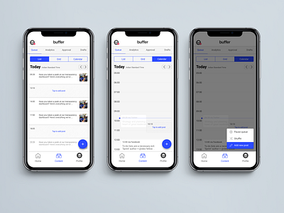
These screens showcase 1-day schedule at a time with ability to view schedule for next 3 days. The reason behind this constraint is I don’t want to overwhelm users with barrage of information.
People on mobile want to perform easy and quick tasks. 1-day view provides them enough context to take decisions immediately. If the ask is to view monthly or weekly schedule, it would be best preferred at desktop as the goal would be completely different from what they want in mobile. It also features easily identifiable empty slots and fill in the gaps.
Though FABs are very android specifics, it is a common pattern in some of the iOS apps (recently Twitter, Lyft, Uber etc). I brought pause queue options here because the actions available were contextually aligned to the current screen and provided better mental model.
You can read more about the case study here:
https://uxdesign.cc/designing-overview-of-scheduled-content-for-buffer-mobile-app-a-case-study-1fe3d141fad2