Perry X


I went to school with Perry and have done various design work for the foundation in the past. When meeting Perry recently we discussed his brand and the objectives of a rebrand.
First and foremost Perry Cross is the brand of the foundation, people come to his charity events to support him and his cause. This is his legacy and I wanted to create something that would represent his positive, inspiring story, and not the misfortune of his accident.
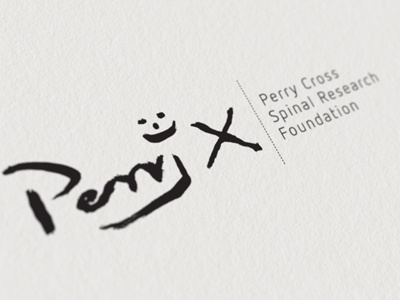
The X for Cross and the colour green has always been the one consistency over the years. Originally I thought the X simply represented his surname 'Cross'. When chatting to Perry he explained to me that it all started because it was his only way of signing his name. This was his mark, and it was at this point the penny dropped for me. There was no graphical wizardy in the world that I could come up with, that could strike the emotional chord and better represent Perry and the X, then if he was to do it himself.
By using his signature artwork as the mark for the logo, we make that direct connection to Perry and assure his legacy and his mantra “everything is possible” is captured with in the foundation.
So I set Perry the challenge to stick a paint brush in his mouth and come up with his own logo.
To read more about Perry and to view the full presentation, go here http://www.behance.net/gallery/Perry-Cross-Spinal-Research-Foundation/3854711