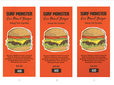
Tiki Burger Menu Screens (A B C test)
I designed three options for this screen. B and C are similar but I used a slight gradient to darken the bottom section of the screen and the dots fade all the way out on the edges.
More by Richard Mullins View profile
Like

