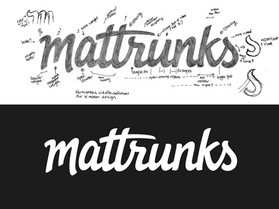
Mattrunks final
The final logo that went live a couple of days ago as part of the new Mattrunks site launch. (This tagline version is used primarily on the Facebook page.) A big thank you to everyone for the suggestions on the first draft, the revisions worked really well!
The major changes I made:
- More space between the 'M-a', under the 't' crossbar, between the 'k-s' and the closing of the 's' bowl.
- Adjusted the end of the 'm' so that it swoops under the 'a' better
- Revised angle on the top of the 'a' stem so it fits better with the crossbar above. Overall letter is slightly shorter too.
- Revised 'r' (top left area and main stem) and spacing in relation to the 't'
- Adjusted angle/length of 'k' arm and spacing with the 's'
- New top of 's' to mirror 'r'

