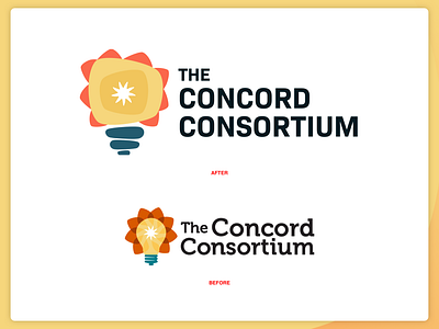
Proposed Logo Refresh
Proposed logo refresh aimed to modernize the look and feel of an organization dedicated to transforming science education through technology. The goal was to inject a bit of "good weird" while still appealing to the audience of specialized educators that the organization serves. The result paired an existing brand element of a "bubble" holding shape with an abstracted riff on the lightbulb in the existing logo, and a cleaner brand font. The refresh was ultimately passed on, as the organization determined a rebrand was too much of an undertaking at the time.
More by kped View profile
Like
