Metamask Redesign
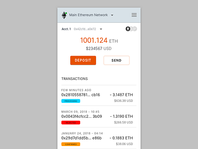

My concept redesign for metamask.
Beyond a facelift ( I used the colors of the fox mascot) I tried to organize the interface.
Removed the Fox brand because that will be displayed on browser. No need to repeat it in the UI.
Instead of multiple navigation triggers there’s just one. Menu triggers are contextual and secondary to the main settings navigation.
That will cut down on the confusion of which hamburger button the click.
Switch between tokens by clicking the icon series. They’ll expand, allowing access to other tokens or adding new ones.
I used the Inter UI font family for this one. It really took the guess work out of legibility for something this size.
https://rsms.me/inter/
Let me know your thoughts.