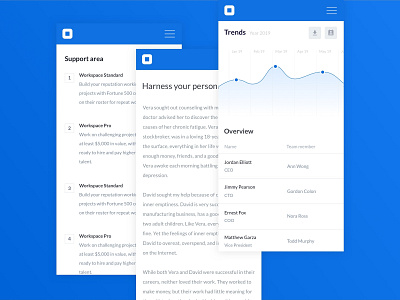
Mobile Dashboard UI Design
👉 Designing mobile responsive dashboards can be tricky at times. The most significant challenge being is the fact that to create a simple visual solution of a complex set of data, you need to think through what's important for the user and what isn't.
.
……………………………………..
.
👉 Over the years I worked on several mobile dashboard projects, being dedicated apps or mobile responsive versions of desktop dashboards.
.
……………………………………..
.
✅ One thing that I learned is that you have to design with the "Fat Finger" in mind. We’ve all been on our mobile device and tried to touch one thing but ended up selecting something completely different. This can be frustrating and time-consuming. Once a user reaches your dashboard, you want to remove these barriers to information consumption—including any click paths to dive deeper and explore other visualisations.
.
……………………………………..
.
✅Make sure to incorporate spacing between filters, links, and visuals. The small screens on most mobile devices make it challenging for users to select objects that are right next to each other.
.
……………………………………..
.
✅ Touch targets should be at least 48 x 48 DP (display picture), and they should never overlap. This ensures users will be able to reliably and comfortably target them with their fingers.
.
•
Want to ask me a question?
📩 DM Me
•
👉 Follow me on my YouTube channel:
youtube.com/channel/UCgOoP5NSZ1HA5dgJg2I8k0A
•
😉 Connect with me and visit my website:
www.pierluigigiglio.com
.
👉 Check out my Design UI Kits to help you with your next project:
www.ui8.net/users/pierluigi-giglio

