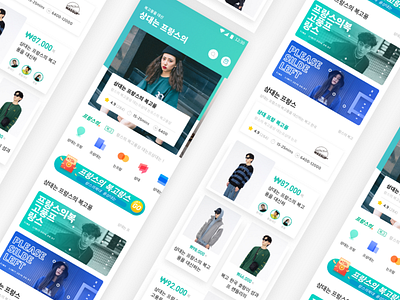
E-commerce Page-Work Project
对韩国本土电商视觉语言进行拆解,归纳成关键词进行优化,依据本土用户视觉习惯,作为垂直平台为特定人群特定偏好服务。
主基调使用糖果色系
卡片圆角缩小
架构垂直化
icon上去渐变与投影并放弃细节特征,
并根据页面功能和用户需求,将卡片内的元素进行关键程度的强弱排序:价格 > KOL示范 > 事项名称 > 分类标签 > 具体信息
业务方需要采用大量的UGC内容,此页面设计的重点之一也是如何使低质量的ugc内容通过视觉包装提升整体视觉,并且这种包装形式应是可复用的
It is the core competitiveness of the vertical e-commerce to disassemble the visual language of the local e-commerce in South Korea and optimize it into keywords to serve specific preferences of specific groups according to the visual habits of local users.
The main tone USES candy colors
Make the corners smaller
Architecture is vertical
The icon on the gradient and projection and give up the detail features,
According to the page function and user demand, the elements in the card will be sorted by key degree: price > KOL demonstrates > item name > classification label > specific information
The business needs to adopt a large amount of UGC content. One of the focuses of this page design is how to make low-quality UGC content enhance the overall vision through visual packaging, and this packaging form should be reusable

