Stonebranch Branding Refresh
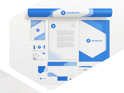

We had a lot of with the Stonebranch brand refresh. Alot of what we did was determine how we could incorporate the Hexagon shape into the brand. In nature, the Hexagon has some really great symbolism around productivity and work and it was already used in some of the brand assets. It was our job to see how we could elevate this concept and modernize the Stonebranch brand. Enjoy!
Check out the entire Behance Case Study - Check it Out
Let's build 🏗️ and launch 🚀 something beautiful 🌈 together! 🙏
For project inquiries: brightscout.com/contact
Follow us on Twitter || Instagram || Behance || Linkedin
Learn more about us on brightscout.com