Poster Design
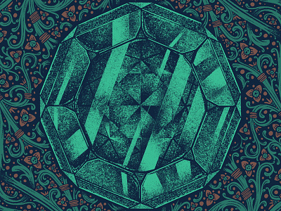
Here's a crop in on the central element I created for this poster design I've been tinkering with. I thought this gemstone came out looking really neat. Was a neat exercise rendering it using one color.
I'll post more from this project soon! It's a bit of a monster.
-
More by Isaac LeFever View profile
Like

