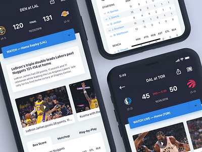
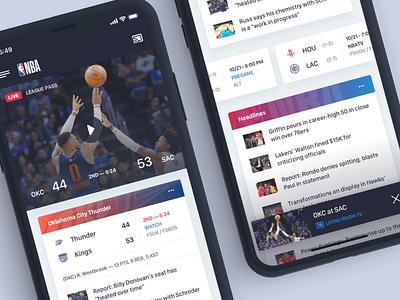
NBA App Game Details
For this quick exercise (and being a big basketball fan), I wanted to simply take the existing NBA app and see what I could do to sand down a few rough edges and give prominence to a few design ideas that I'd like to see implemented.
I pulled some score bug hierarchy ideas from ESPN since they deliver all the pertinent game details in a clean/concise manner, some design structure from a few other apps, and tried to stay at least mostly true to the look and feel of the existing NBA brand.
My goal was to create a clean, minimalist look that featured your favorite teams scores and news (as well as video tied into League Pass), while also highlighting scores and headlines from around the association. If a game was live and you tuned in to watch via the hero image, a small compact player will appear as you scroll.
If you're still reading by now, cheers to you and thanks for listening.
Hit L if you dig.


