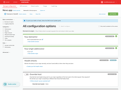
Navigation hierarchy for configuration
Exploring ways to make navigating more intuitive and clear.
In this mockup, a subnav is added to the CONFIGURE screen, so that lateral navigation is possible between pages that support the configuration workflows, but are not themselves configuration pages.
To declutter the top white bar, icons were removed, text was reorganized so that 2 rows emerge more distinctly - the first row for everything about the News app service, and the second for everything about the Version of configuration that is on the screen.
More by Fastly View profile
Like

