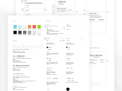
Beta Style Guide
Originally thinking I was going to go with a more colourful brand, I opted to work with a black/white palette inspired by high fashion trends. I'm not sure if I'll stay in this area very long as I have other ideas about how the actual launch of Jupiter will be like.
We're still in beta testing phase and so far reviews have been generally favourable about how it looks/feels. The benefit to our team though is that it's relatively easy to implement... so far it's a small app and the components aren't too complex.
You'll see in my attachments that I have a general 'measurements' page which may seem unnecessary to some as there are some software solutions which purport to be able to spit these numbers out. I haven't found one I particularly like yet though so I still do it old school.


