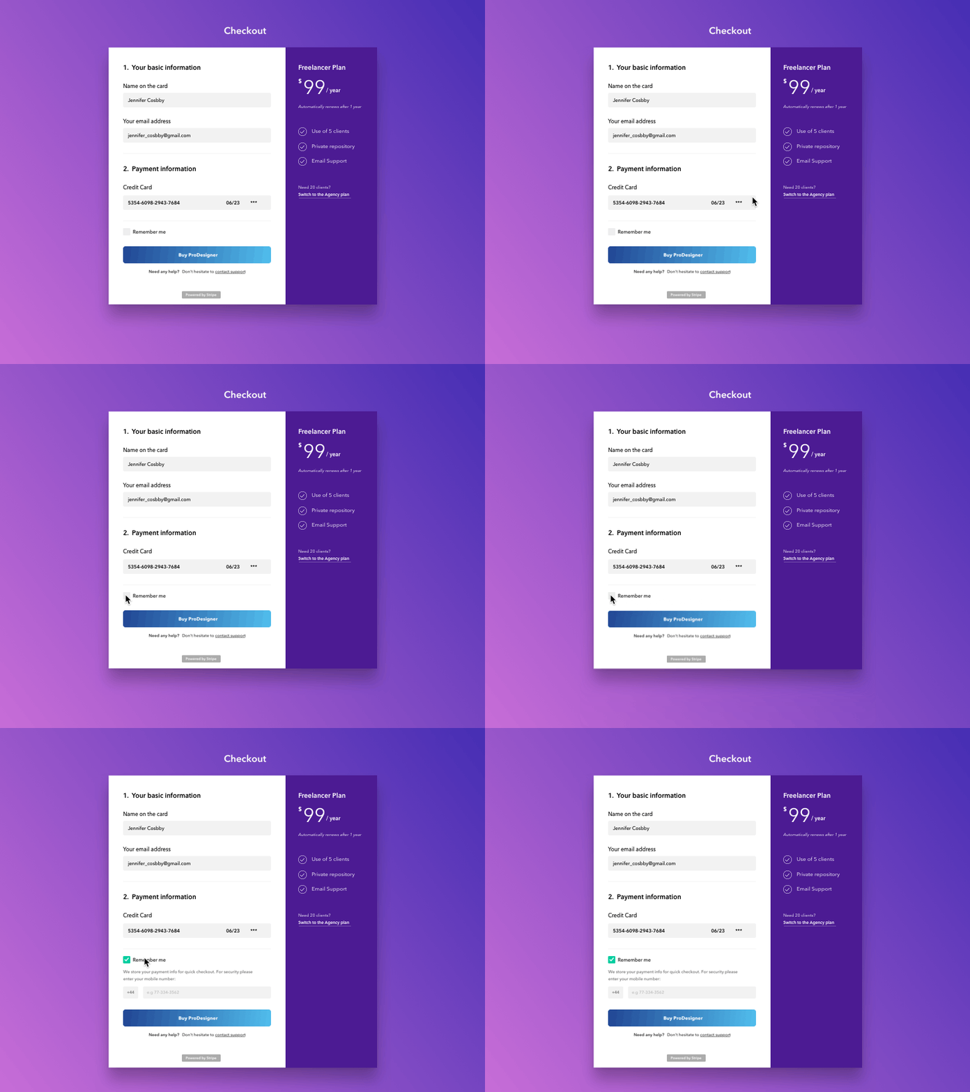
[UX] Progressive Disclosure pattern in forms
Hello Dribbble friends! 👋 I wanted to experiment with 3 things for this shot.
1 - How can Progressive Disclosure work in forms. Basically the the concept is to present only the minimum data required for the task at hand. Reveal only essential information and help manage complexity by disclosing information and options progressively.
2 - I've been observing other Progressive Disclosure patterns like "Show more" from @Facebook , @Instagram and @Stripe and what they do is that they add a little spring animation in the end.
3 - I wanted to experiment with Motion Design Guidelines from @Google where elements contract faster than they expand. For this one I've used 200ms for the expansion and 180ms for the contraction.
Hope you like it and find it useful as well! 👊
