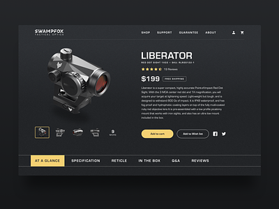
e-commerce Above the fold
Here is a product page of a tactical optics. You can check one of the pages in the attachment.
When I design e-commerce sites from scratch and I have no possibility to make a research or study statistic I rely on guidelines from Baymard institute and NNgroup. It helps to launch a convenient product from the start. After, you can get some statistics and user's feedback and improve existing results.
Here are some tips which can help to improve conversion.
1) Always provide no less than 3-5 high-quality images for all products.
Users heavily rely on product images to inspect, evaluate, and decide if the product match what they are seeking.
2) Show products "In Scale".
Users are unable to get a sense or evaluate a product’s size when only provided with “Cut Out” product images.
3) Product details page sections in horizontal tabs suffer from discoverability issues. But if you want to use horizontal tabs (like me in this example), make it sticky. Check https://bhphotovideo.com to find a good example of how to do it.
4) Make "Add to cart" button look unique and prominent.
When secondary buttons are styled similarly to the primary ‘Add to Cart’ button, it becomes needlessly difficult for users to add the product to the cart.
5) Style product price to be highly visible.
Users will be extremely frustrated if the product price is difficult to find.

