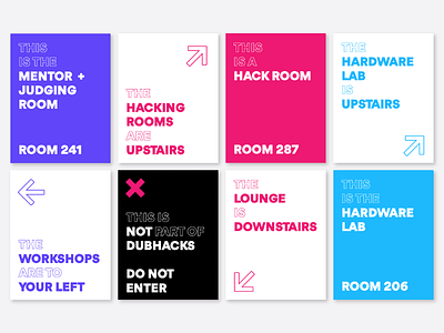
Wayfinding Signs
An overview look at the wayfinding sign system for the event venue. With multiple floors to account for, we were looking to create a templated system that was easy to modify and expand, while also being fun, easy to read from a distance, and on-brand.
The biggest difficulty of this was distilling the essence of our brand, which is defined by its loud and bright illustrations, into something that first and foremost emphasized utility over aesthetic. Overall, we were able to maintain consistency across dozens of different signs across the venue, and using the template created signs day-of that we hadn't anticipated we would need.
More by Justin McKissick View profile
Like

