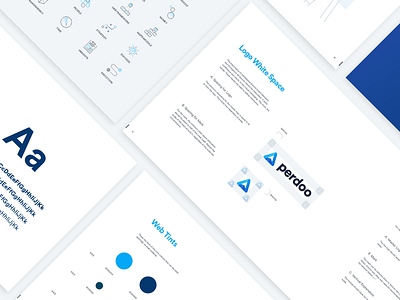
Perdoo Guidelines
Perdoo asked us to completely rethink their visual identity and come up with a logo that reflected who they are as a company.
The concept: An abstract ‘snowy mountain’ and ‘up arrow’, symbolising how their software helps businesses hit their goals.
These are the guidelines to go with it. Let us know what you think!
More by Will Beeching View profile
Like
