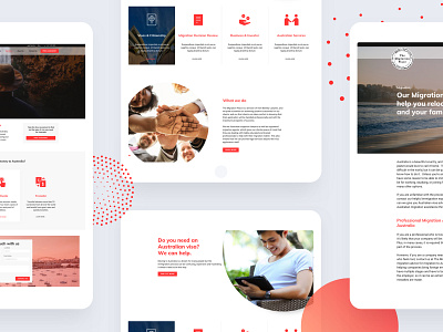
The Migration Place Website
The brief was to create a new website from the existing one to get users to take the free assessment and educate users on all the visa categories available in Australia.
I had such an excellent time working on this project as there were no brand guidelines to follow. I had the complete freedom to give it a unique look and make it stand out from the competitors.
To do that I started playing with circular shapes as that's the main shape of the logo and ended up creating patterns to give it a vibrant style.
If you would like to check out the project follow this link http://www.themigrationplace.com/
More by Shremal Patel View profile
Like

