R
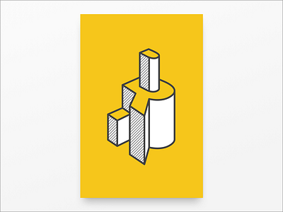
Using dimension and abstraction, I wanted to communicate the importance of perspective. Identifying the "R" amidst the shapes becomes coupled with the idea that from another vantage point, the letterform is legible.
*This submission is from the DY Alphabet design challenge our design team created. Each of our designers was randomly assigned a letter in DockYard to create a poster. The rules were simple: design a poster that "represents your letter" given specific parameters (size: 24: x 36", colors: yellow (#FCC71F), black and white).
More by DockYard View profile
Like

