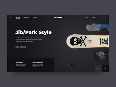
Promo Website for a New Line of Snowboards
Hey guys!
I keep experimenting on how a promo website for a new Bataleon snowboards line might look like. This is its homepage main screen where you can check out different boards of the new line by scrolling them on the right screen section. All snowboards are grouped into three categories: Jib/Park, All Mountain, Freestyle, and there’s a separate page for each category where users can learn all they want about the product.
Goals
Designing a website to promote the company’s new product line in such a way that it appealed to the target audience and adhered to the brand’s aesthetics.
Approach
As the company’s style tends to minimalism, we chose to use Scandinavian style while designing this website. We put all the key information such as board characteristics and video review on the main screen so that users could easily find it. The idea was also to experiment a bit with the composition and come up with some unusual, fresh solutions. To that end, we played with the geometry of the layout and applied golden canon grid which helped us achieve the goal.
Results
You can see above what we ended up with. I’d like to think that it looks pretty clean and gets the job done. In one of my following shots I’m gonna share the animated version of the website to show how users will interact with the design. Stay tuned! And do let me know what you think of this!
Press :"L" to show some love!


