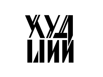
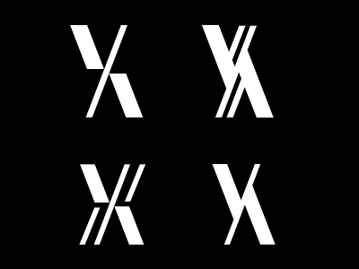
rejected logo option
Another rejected option. It just didn't feel right for the client and I wasn't satisfied with the contrast of styles between the rows.
However, I like the challenge of combining the two one day just for the fun of it, so I'll live it here before that happens:)
More by Viktoria Stalybka View profile
Like

