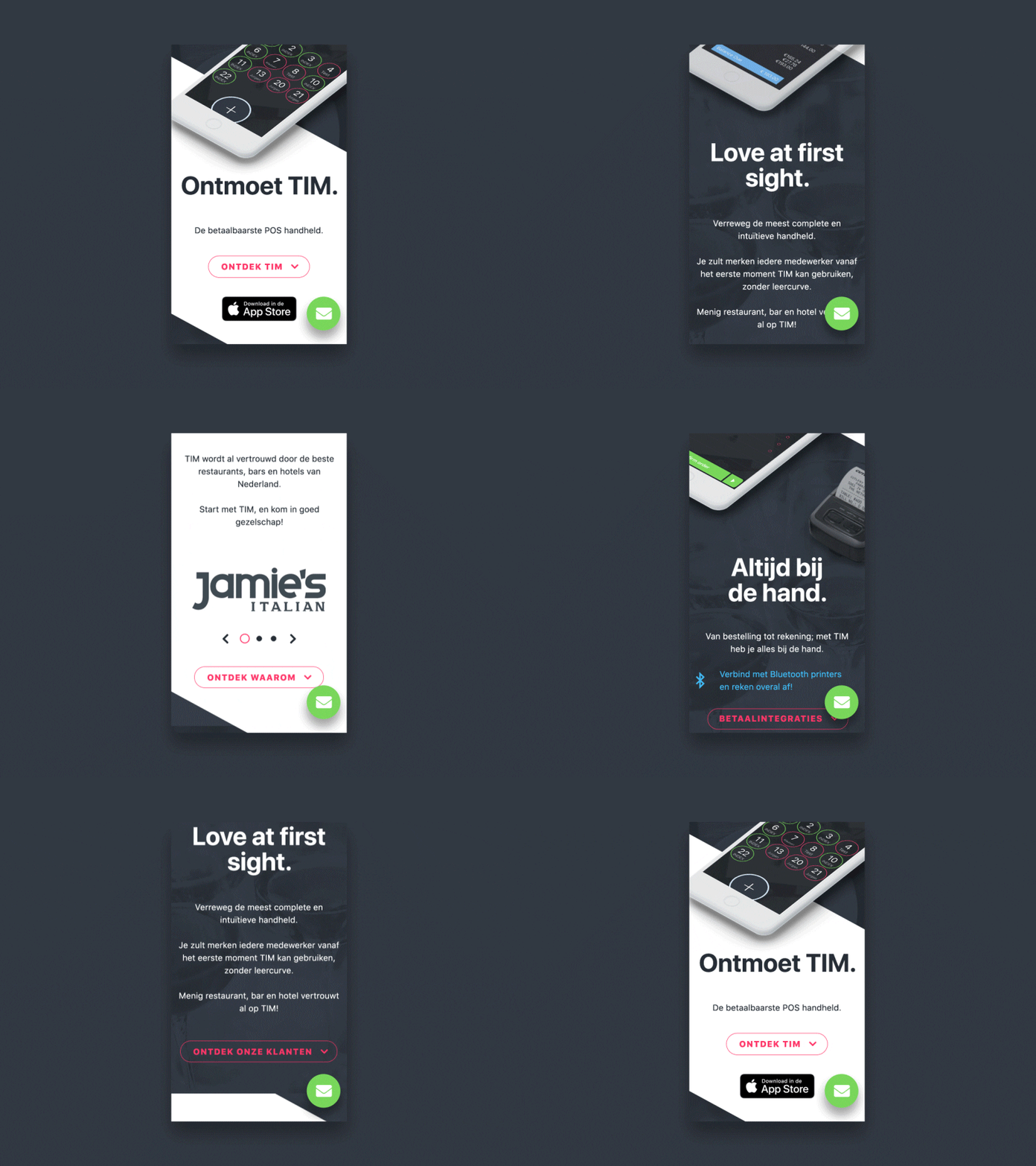
Mobile landing page scroll animations
Having designed a nice landing page, I left one important factor out of the equation: responsive design. Here's my interpretation of the mobile breakpoint. As you can see, the animation is more subtle, since the mockup may interfere with the content if you'd animate it like the desktop design.
The design is more strictly cut into sections here; the intended styling will be more in line with what you've seen at the previous design for the desktop breakpoint. The diagonal lines will stretch over the full width between sections.
More by Jeroen Rood View profile
Like

