Design language exploration for Araminta's Attic
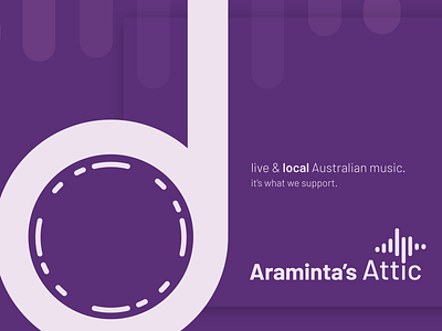
Another shot from the Araminta's Attic project. This time we were wondering how we could use the logo - specifically the note - in a way that captivates attention.
To do that, we had to create a mock design language for the Araminta's Attic brand - the way it uses colour, text, and graphics to grab attention and maximise recognisability. We used the base of the quarter note as the core element of all the graphics. It was the anchor point for all the designs, and expressed the brand's identity at a glance.
They loved it.
What do you think?
Send us some love <3:
hello@heurist.com.au | our website | our Facebook | our Twitter