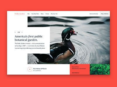
#designabovethefold ep.1 - Public Garden
This was an exercise I gave myself after reading "Scrolling and Attention", a UX research article that found "users spent about 57% of their page-viewing time above the fold. 74% of the viewing time was spent in the first two screenfuls."
In other words, users will spend half of their time on your website looking at the homepage header.
That's a challenge to us designers. On the one hand, we need to use this precious real estate to communicate a client's story and how they can benefit the life of the user. But, we also can't treat the header like Times Square - lit up with myriad CTAs and tons of content.
Extended process on YouTube.
Summary:
I started on Unsplash and found this beautiful photo by Bogdon Pasca. It reminded me of Make Way for Ducklings, an old children's book about a duck family making a home in Boston's Public Garden. So, I decided to make a header for an imaginary new site for P.A.
The goals were to:
• Feature the garden's botanical mission
• Encourage tourism
I tried to accomplish both through the:
• Navigation link structure
• Clear headline
• Slide of lovely photos
• CTA - Watch a video about Public Garden
• Featured Plant Species
If you want to give this exercise a try, rebound this shot with your idea! Or, tweet your shot with and tag it #designabovethefold. It would be fun to see how others handle the challenges, keeping in mind that users will spend 54% of their time looking at this one section.
