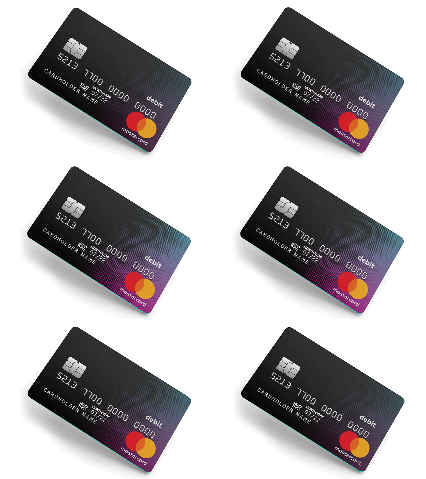
Scrapped Card Design
Scrapped design for a new debit card. I wanted to push the design by using a metallic/holographic process to add some interactivity and break the monotony of our usual plastics. 🤙
More by Ty Martin View profile
Like
