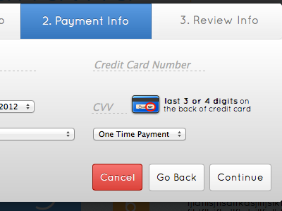
Modal Payment Form
My first shot here on dribbble a big thanks to @Pablo Imapallari for drafting me! The "Payment Info" Section of a donation modal I'm working on for my lasted client, I got the idea for the CVV credit card icon from an image posted on Forrst (Side question: are references to Forrst even allowed here?). You are looking at the hover state of the cancel button. In the normal state, the cancel button looks just like the "Go back" and "continue" buttons. The hover state of the "go back" and "continue" buttons is similar to the blue gradient up on the "Payment Info" header. What do you guys think?
Here's a link to the full image http://cl.ly/142M3t3k1F0X1w2a1W0J
The image on the bottom is what it looks like with text entered into it.
All feedback is welcome.
