Branding for Den and Ui Mockup
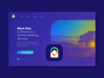


Branding for Den, a Smart Eco Home Heating Service.
As in every identity project, I enjoy the creative exploration part the most. It gives you creative freedom while you’re looking for that perfect match.
For this project I felt a clean and smart icon was needed, so I was first looking for a nice connection with a home symbol. Later I explored more directions within the color wheel to communicate the heat element within Den’s service.
I also ‘discovered’ that using Braille in logo design can be super interesting. My idea with this concept was that you really have to ‘feel’ the warmth (same as Braille: you need to feel it first to know what it means) and that referred nicely to the feeling-sense of Den’s service. Later on I felt this concept may not hold the weight of what Braille communicates in other contexts. So route 3 + 4 were created (see attachement).
First with the intention of keeping it all simple and with one ‘endless line’, and then I felt the need to include a warmth/heat element which can be seen in my final option.
At this point I’m still not 100% sure if the 3rd or 4th route is the best. But it’s all about exploration and making the connection between what a mark communicates with the brand/service and if they are in line of what people should see and understand when looking at the visual meaning of it.
Check out this brief at @Briefbox and contribute:
https://briefbox.me/briefs/branding-for-den/