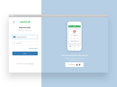
Workruit Platform: Login Page
Hey 👋🏻
In the next few shots, I want to show Workruit platform inside. Previously I designed the website for them and we decided to collaborate on the platform design.
The login page seems easy. Just divided screen and nothing else. But behind that, we solved problems with different screen resolutions, how to show all the information when we sign up even if we don't have enough place for elements.
There is a lot of work on different states of fields and different page conditions like Sign Up and Password Reset.
Also, as part of the task, we should reuse current brand colors.
More stories and shots will come!
Stay tuned 😉
More by Sam Abdullaev View profile
Like
