Re-drawn italic ‘O’
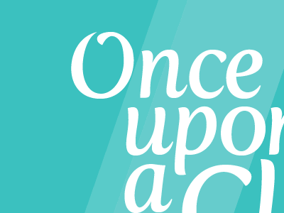
I’m in the middle of adding a calligraphic ‘O’ to Jos Buivenga’s beautiful Fertigo Pro Italic for a bit of logotype; thought you may be interested. Thoughts welcome.
I should mention, the original ‘O’ is a complete ellipse without the aperture and swash, in case you weren’t aware already.
