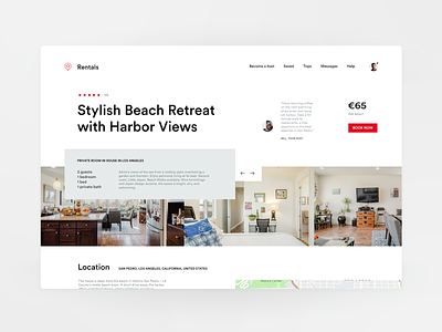
Page: Apartment for Rent (Header on desktop/tablet)
Hi loves! 👋
This is my take on the rental business.
I always start designing with the "sell page", the product. What are we trying to do? Sell something? Book something? That's where we need to start, not with the homepage. 🛍 📍
The gallery is a little bit hidden behind a grey box. If you try to scroll it or view an image, the box hides behind the gallery (or collapses up), so you can see all images clearly. 🖼
The page continues with more details below.
I used an "airbnb red" 🔴 (funny how some colors just start to belong to a brand; that's a good, recognizable design).
Done under an hour, while baby sleeps her afternoon nap. 👶
More by Darinka View profile
Like

