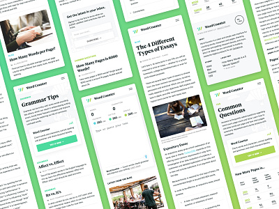
Word Counter Responsive Design
A big part of the Word Counter relaunch included a souped-up mobile experience, focusing on clean, legible typography, balanced white space and, of course, an easy-to-use editor. 📝
Each section of the site was given a color: the blog is blue, grammar tips are sea green and the FAQ a lime green. The colors are used throughout to highlight actions like buttons, section titles and URLs. 🎨
More by Alexander Dixon View profile
Like

