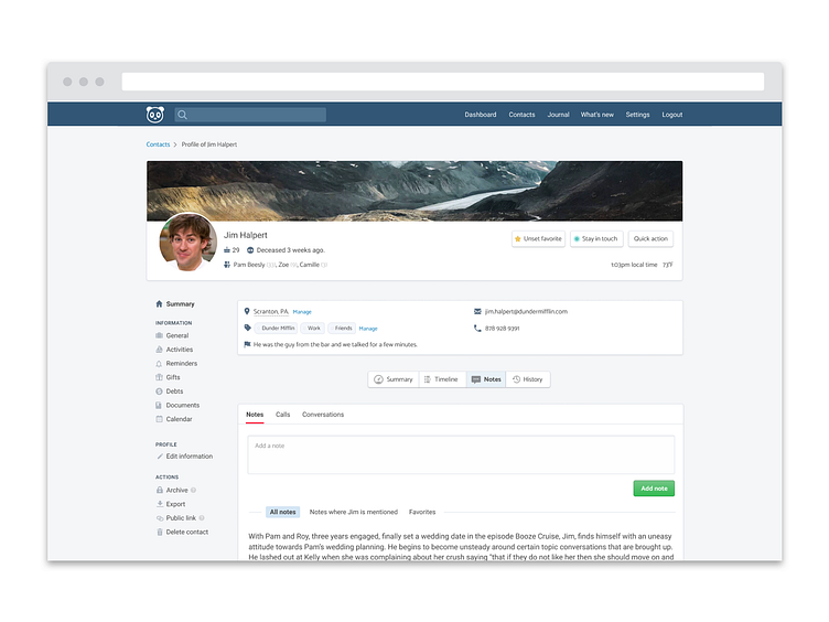
Profile page
I don't know if I'll stick with this design direction, or even the general layout. I'm just looking at different directions right now. One of my biggest question is, considering how much data now people can enter now in Monica, whether I should stick with all data in one single page, or if I should like the screenshot shows, split the content into multiple subsections, accessed through tabs and a side menu.
More by Régis View profile
Like
