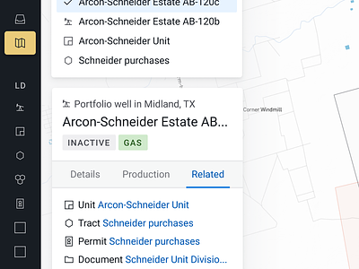
Portfolio well detail pane
This is an updated detail section when a user clicks on a map. This version is much more focused on the data than the previous, while still allowing for production data visibility via the "Production" tab.
This version should also be easier to build, leaves space for a cleaner, clearer click disambiguation section, and is much more focused than the previous iteration.
It's crazy what fresh eyes can do to a design. :-)
More by Alex Price View profile
Like


