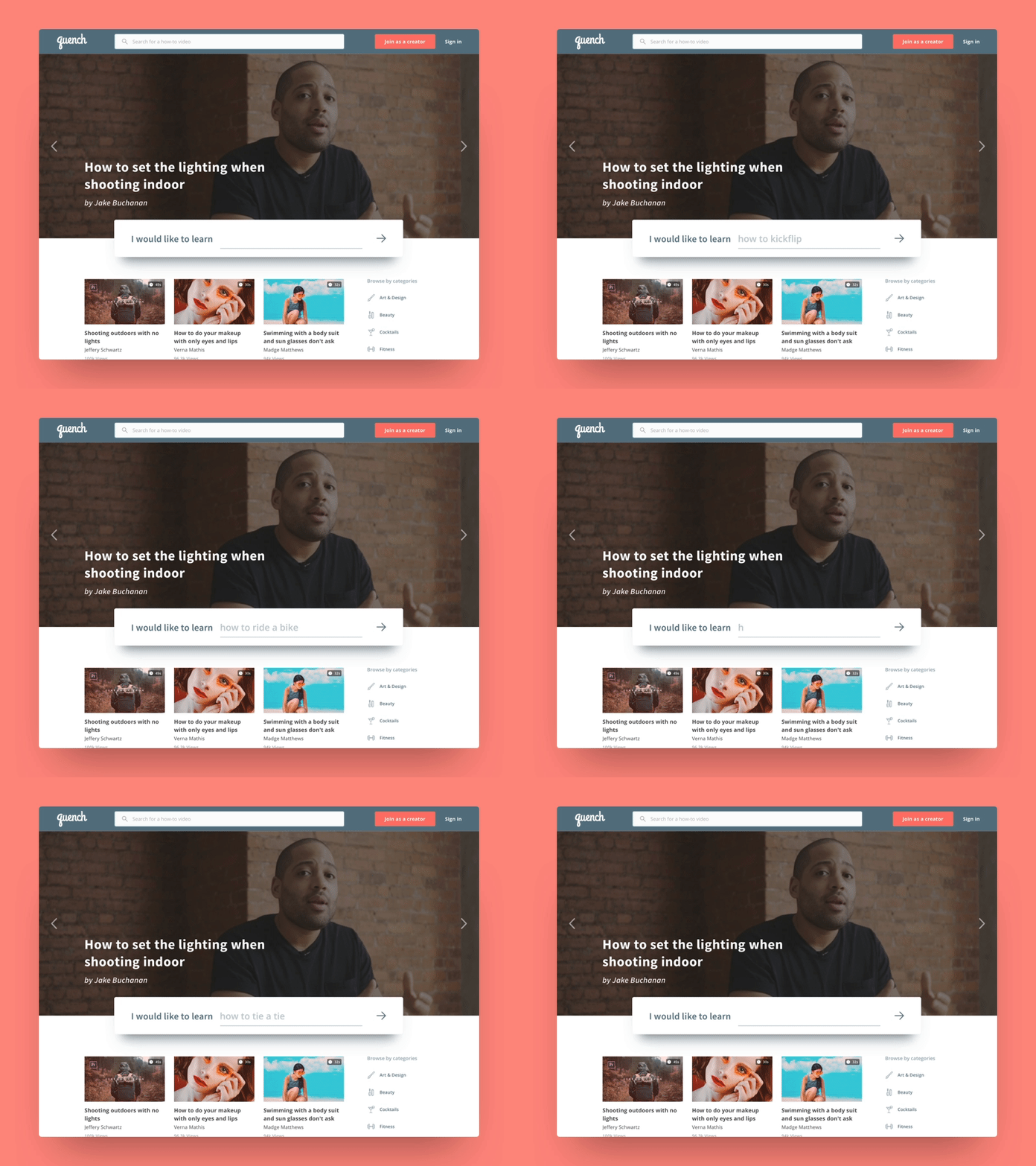
Quench - Home
With the launch of Quench right around the corner, I wanted to start uploading shots piece by piece and talk about the decisions behind each screen.
One of the key takeaways of the home page is apparently the big search bar right in the middle of your screen. This is mainly because of the very first use case of the product, looking for a particular video tutorial to learn something. Since this has a specific cause, we wanted the copy to be encouraging and assisting (hence the "I would like to learn" pre-fix) as much as possible.
--------------------------------------------
I'm looking for new opportunities! Either fulltime or freelance, if you have anything I can help with, I'd be thrilled to discuss 👇🏻 nseckinoral@gmail.com
More by Nejat Seçkin Oral View profile
Like
